BLOG

Package Design I Love – #1

One can find inspiration anywhere and everywhere—I find quite a lot of it at the grocery store.

Here's a look at some recent package designs that have caught my little eye~*

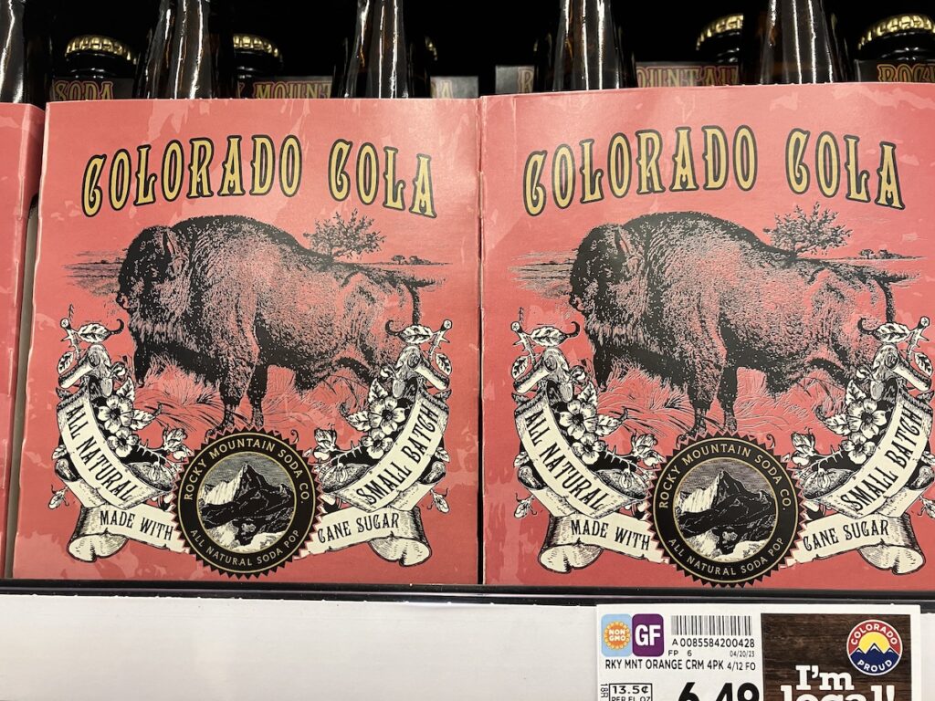
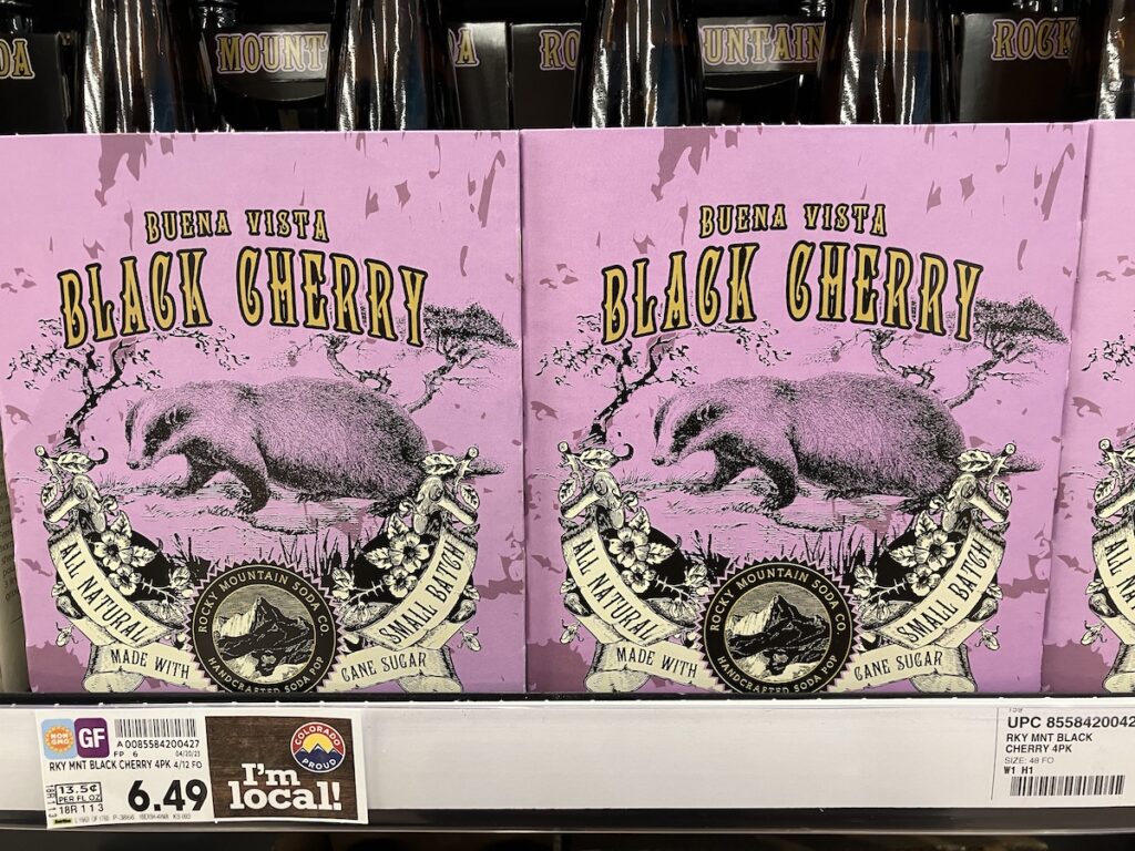
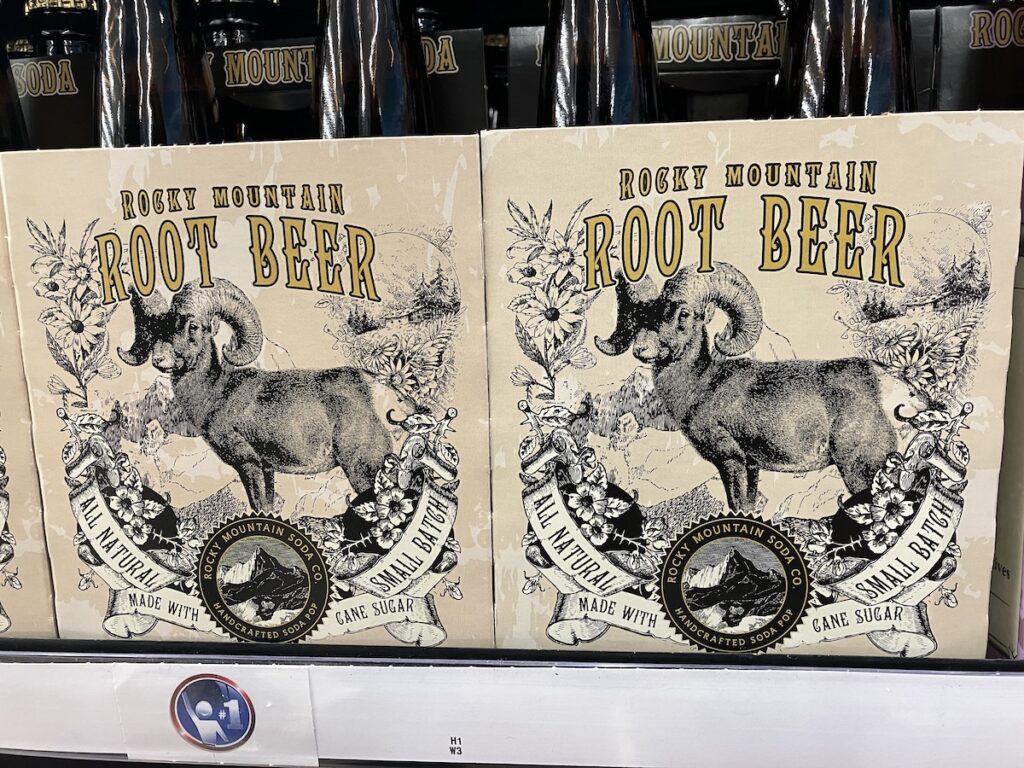
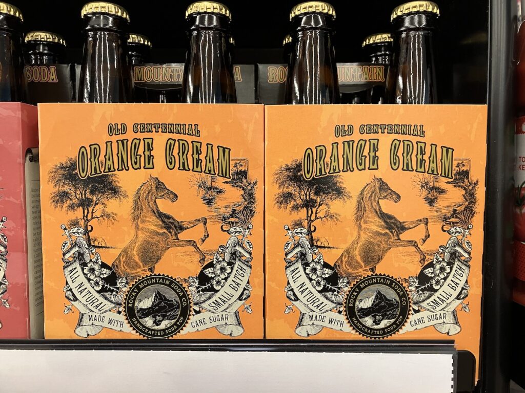
These were a series of local, handcrafted pop I came across in Denver, Colorado made by Rocky Mountain Soda Co. I'm a sucker for animals (the put a bird on it joke was made for me) so if you put an animal on your package design I'm 75% more likely to purchase the product. LOL

Rocky Mountain Soda Co.'s Colorado Cola pop that shows a vintage styled illustration of an American Bison done in black against a red background.
Rocky Mountain Soda Co.'s Buena Vista Black Cherry pop that shows a vintage styled illustration of an American Badger done in black against a purple background.

Rocky Mountain Soda Co.'s Rocky Mountain Root Beer pop that shows a vintage styled illustration of a Big Horned Sheep done in black against a cream coloured background.
Rocky Mountain Soda Co.'s Old Centennial Orange Cream pop that shows a vintage styled illustration of a rearing horse done in black against an orange background.

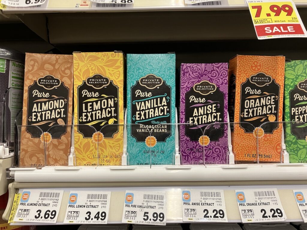
I loved the hand-drawn typography aesthetic of these extracts that also coordinated colours and design details that related to each particular extract.

A photo showing a row of Private Selection brand pure extracts for baking. Each box has these lovely illustrative flourishes and a handdrawn typography feel. Each box's colour also corresponds to the extract itself (almond is brown, lemon is yellow, etc).

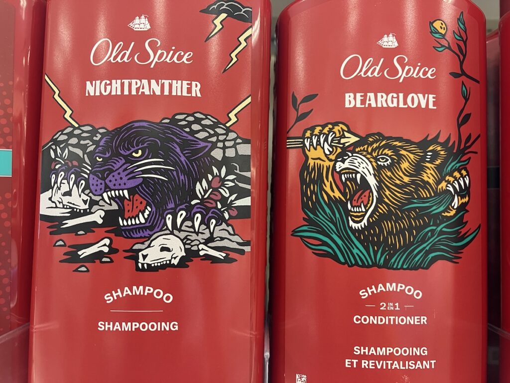
Old Spice ALWAYS has incredible package design, and I was particularly fond of these woodblock stylised motifs.

Photo of two Old Spice hair care products. The stylistic design for these animal icons on the products resembles that of a woodblock relief print. One is NIGHTPANTHER which features a purple and black with it's paws gripping mounds of skulls and lightning in the background. The other is BEARGLOVE which features a orange and black bear angrily roaring is it grabs arrows in one hand and rips blades of grass in the other.

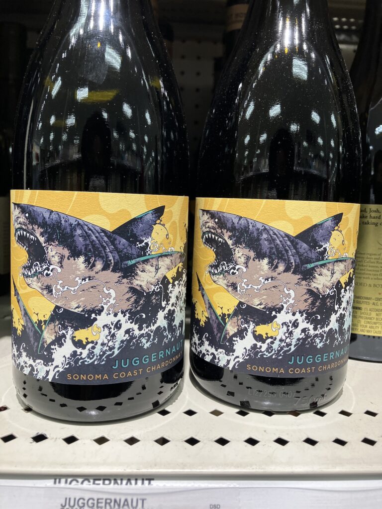
I don't drink but I often find some really cool label designs in the spirits aisle.

Bottle of Juggernaut brand chardonnay that features an illustrated shark leaping out of the water.

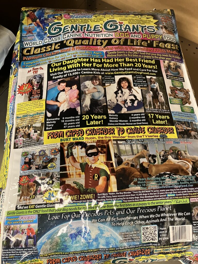
I'm such a big fan of the maximalist, early 2000's geocities website nature that radiates from this bag of Gentle Giants kibble. It is over the top; it is absurd; it's the total opposite of you'd expect compared to design trends of today.

A photo of a bag of Gentle Giants dog kibble. The package design is if Doctor Bronner's made a dog food but with images and not text all over the label. Images range from past customers with their dogs to Robin from Robin, the Boy Wonder tv series.

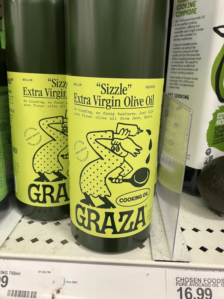
This package design screams "FUN" to me, and I really love the deep olive green of the bottle itself. Seeing this design I thought to myself, "I hope more package and label designs start to have fun like this again.

It's a photo of a bottle of extra virgin olive oil. The bottle is a deep, hunter green and the label itself is a brighter olive green colour. The label says: "Sizzle" Extra Virgin Olive Oil. No blending, no funny business. Just 100% pure Picual olive oil from Jaen, Spain. GRAZA (I think GRAZA is the brand). The illustration design on the label is of a stylised person looking real smug in a polka dotted dress outfit with boots as they're bending their body holding a bottle of oil over their head, and a pan in the other hand. Oil droplets are drawn falling towards the frying pan.

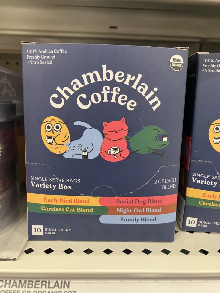
These little animal characters reminded me of the sketchbook exercise that involves creating a blob or random shape of colour, and then drawing whatever you see in that shape—kind of like cloud-watching but for art.

Photo of a box of single serve bags of coffee with different flavours. The brand is called "Chamberlain Coffee", with the following flavours: Early Bird Blend, Social Dog Blend, Careless Cat Blend, Night Owl Blend, and Family Blend. There are 4 different characters with coffee cups on the box as well. There's a yellow owl, a light blue dog, a red cat, and a green bird.

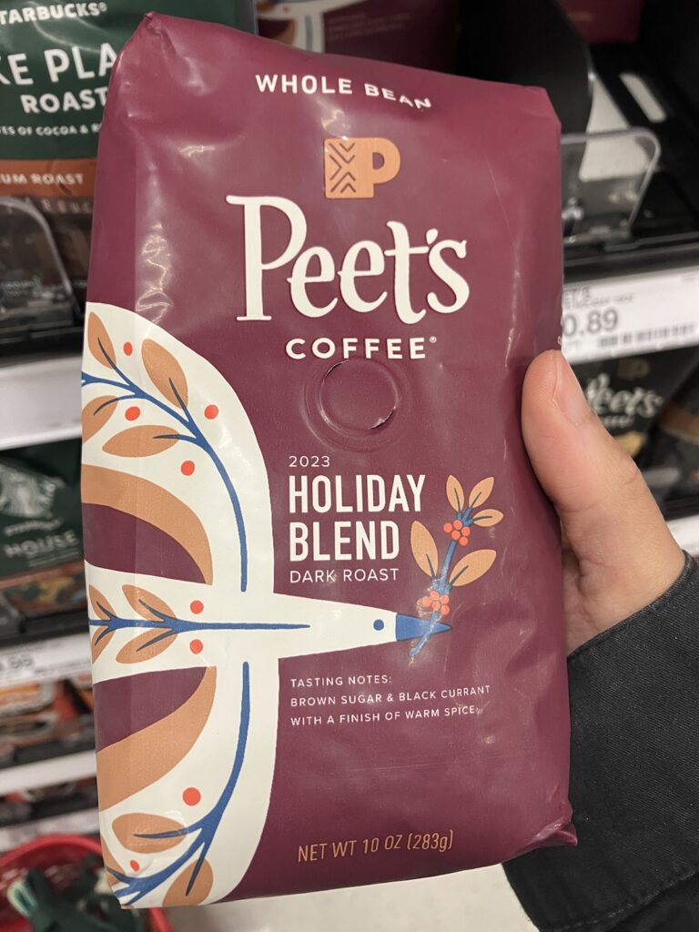
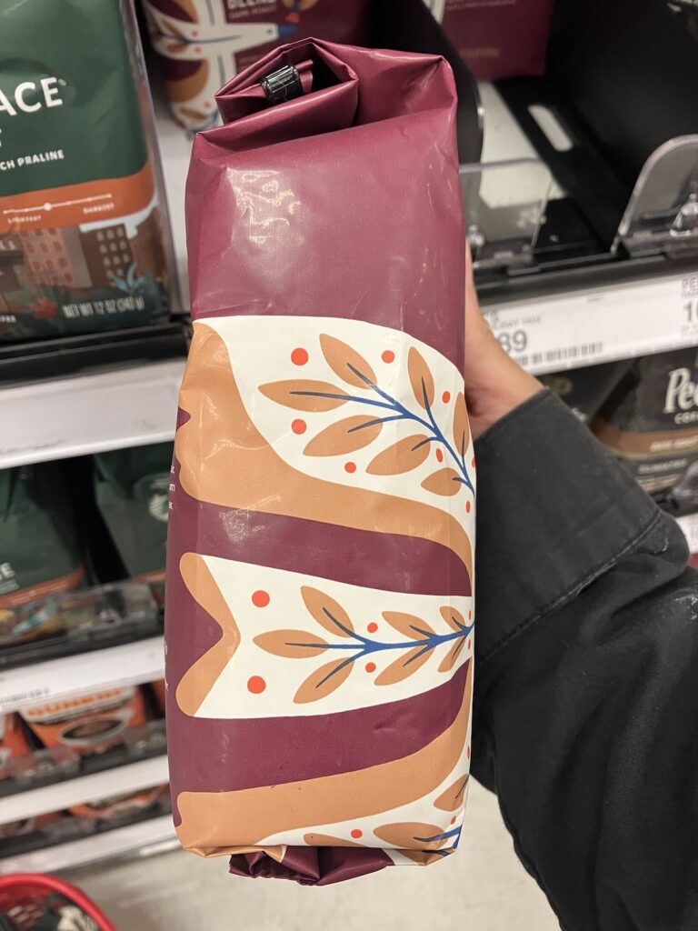
I liked the limited colour palette found in this package design along with the stylised bird and the foliage designs on it's wings! I'm always on the lookout for different stylised ways I can draw foliage and flora.

Front packaging of Peet's Coffee Holiday Blend Dark Roast Whole Bean coffee. The bag itself is a nice maroon with a cream coloured, stylistic bird that has floral details on it's body and a sprig in it's beak.
Side of the Peets Holiday Blend bag showing the rest of the bird's body as it wraps around the package.